Higher Ed. Branding Series 1: R.I.T.
The Higher Ed. Branding series came about because my teenage son is receiving mail from U.S. colleges and universities. These promo materials come in the form of letters, postcards, magazines, catalogs, etc. (One college even sent a frisbee!) I decided to evaluate these materials and post my thoughts on twitter.
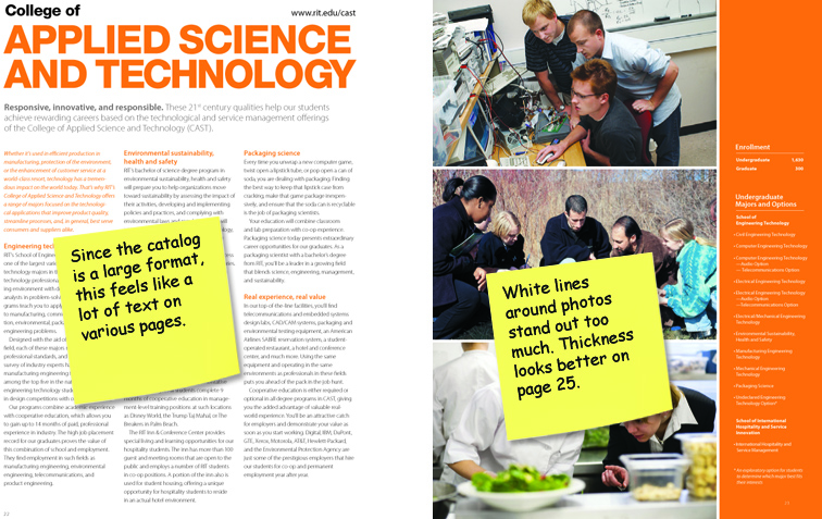
Rochester Institute of Technology (R.I.T.) 9 x 11.75 Prospectus
R.I.T. is a private university located in the Rochester, New York. It is composed of nine academic colleges known for its fine arts, computing, engineering, and imaging science programs.
Overall evaluation: 7.5 out of 10.0 (Bright fun engaging photobook that is nice to look at.)
Strengths:
- Good choice of contrasting colors (orange, dark brown, medium gray and black)
- Good use of large text in headings
- Large engaging photos
- Consistent 3-column large format magazine design
Weaknesses:
- Color’s impact is inconsistent: Subheadings in gray, body text in orange and reversed white text on solid orange blocks are difficult to read. (Font size factors into this as well.)
- Body font looks like the ‘lighter version’ making it difficult to read.
- Inconsistent photo quality (some look professional; some look amateur)
- 3-column large format magazine design makes the body text look like a lot to read especially when it spans two pages; white lines around photos are different thicknesses throughout the prospectus.
Other Recommendations: Since you are using a large format, add in an infographic (map, stats, etc) to diversify your look.
I found a digital copy of the prospectus and compared it to the printed copy. The printed copy seems to have too much magenta in it (See picture above). Some of the weaknesses I cite disappear in the digital copy. I can only assume that there may be some quality control issues with the offset printer.
Click here to view the digital RIT Prospectus.

