Case Study: Branding for National Network of Changemakers
Case Study: Branding for National Network of Changemakers
EPIP Conference Branding
Revlogotagline_RGB
Revolution projects
EPIP Prospectus Slide Deck_Page_01
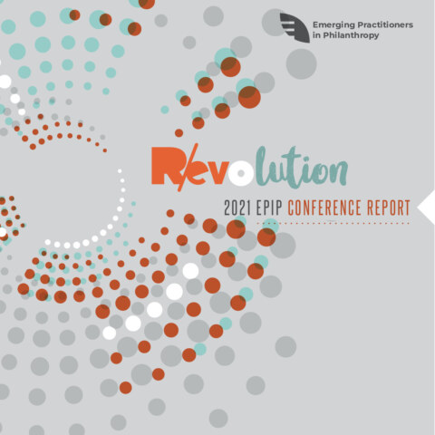
EPIP Post Report cover
Emerging Practitioners in Philanthropy (EPIP) is a national network of changemakers who strive for excellence and equity in the practice of philanthropy. They provide professional development opportunities covering an array of critical issues and necessary skills enabling participants to successfully navigate the philanthropic sector.
Their primary audience are:
-
- Nonprofit Professionals
- Persons from marginalized communities
2021 Deliverables:
-
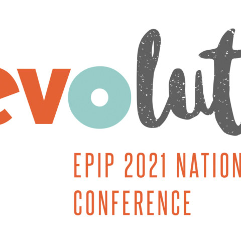
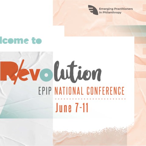
- EPIP 2021 Conference Branding logo: Revolution
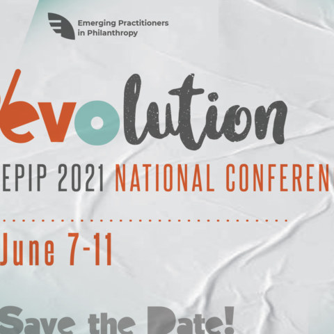
- Revolution Save the Date digital card
- Digital prospectus (click link on right)
- EPIP Conference Report (click link on right)
The theme of this years conference is R/evolution. It recognizes and honors the growth of the organization and the sector over the last 20 years – the evolution – as well as the movement moment EPIP members and foundations are navigating following the massive upheavals exposed in 2020. As philanthropy re-configures itself in service of the movement, so must it transform its internal operations so that we create the conditions for our people to thrive and flourish. The logo communicates this transformation by utilizing two different font styles representing foundation (angular and blocky) and change (slightly cursive). The letters R and e are separated by a slash representing a symbiotic relationship between Revolution and evolution. The slightly hand lettered appearance is a nod to activism and protest signs.
Unpublished Project
For EPIP’s 20th anniversary in 2021, they were balancing two ideas:
- Reunion, bringing our community and alumni back together and welcoming them home.
- Building together and creating a new future for philanthropy,
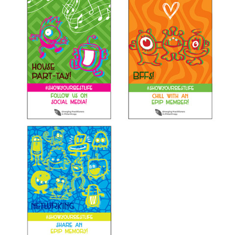
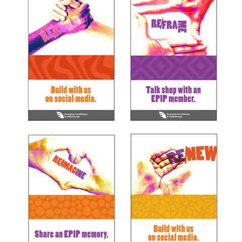
EPIP was zeroing in on the use of the “RE” prefix which influenced their anniversary logo and overarching tagline (see above). Also as the pandemic was still raging earlier this year, they started conceiving of virtual ways for their members to interact. They started developing an online bingo-style game with cards. Each card would be a square and correspond to a task. The two documents below are the early iteration stages of the card game. One idea was to use weird odd fun creatures as a metaphor for how the pandemic has altered the way we look and act since we cannot physically connect with one another. The other idea was to use hands combined with creative typography as a way to communicate. Eventually the idea was abandoned.
Card ideas2
Card ideas3
2020 EPIP Conference Branding
new sankofa logo
new sankofa logo
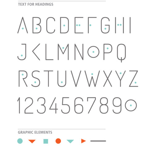
Font
EPIP Program Book Cover
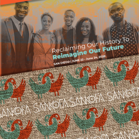
The theme of the conference is Reclaiming our History to Reimagine our Future. The Interim Executive Director wanted the 2020 conference theme to reflect the concept of Sankofa. It is a word in the Twi language of Ghana.
 The first goal was to create a graphic symbolizing the meaning of Sankofa. The Sankofa bird is an Adinkra symbol (above left) with its head turned backward carrying an egg in its mouth. I simplified it and used two intertwined birds to highlight collaboration. It conveys the connection of carrying something from the past into the present to impact the future. An existing typeface was modified to be used with the name and headings in the conference materials. EPIP’s corporate colors are the main colors for the conference.
The Sponsorship Prospectus design is based on the squares as a metaphor for people. The goal is to give the impression that the squares are moving in a direction suggesting the idea of a movement (a group of people working together to advance their shared ideas).
2021 Deliverables
Conference Logo
Conference Save The Date
Digital sponsorship prospectus
EPIP Conference Report
2020 Deliverables
Conference Logo
Custom Typeface
Sponsorship Prospectus

