Case Study: Philadelphia Accelerator Fund
Case Study: Philadelphia Accelerator Fund
Strategy: An increased demand for housing sparked concern about a lack of housing choices for low-income residents. The Philadelphia Accelerator Fund seeks to help fill this gap.
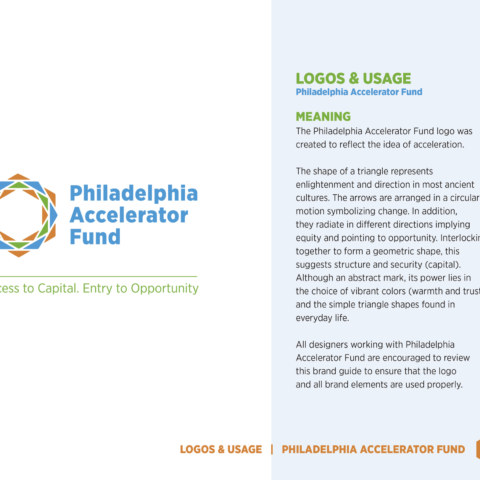
Logo Meaning

Green Logo

The Philadelphia Accelerator Fund (PAF) partnered Octo Design and PSB+D together to develop their brand identity. PAF is a new investment vehicle to enable non-traditional financing products that support affordable housing and community development in the City of Philadelphia. The idea emerged from the City of Philadelphia’s Housing for Equity plan in 2018, to provide an avenue for assisting a greater range of affordable projects and filling gaps within the market.
An independent loan fund like the Philadelphia Accelerator Fund seeks to create initiatives that reduce lending barriers and create pathways for underrepresented developers outside of traditional investment networks.
Because of the various private developers, city agencies and community organizations that intersect with the affordable housing sector, PAF needed to figure out how to position itself as a new player. PSB+D conducted research into the housing industry, local and national policies on housing, competitors and demographics to determine PAF’s brand strategies, brand positioning and brand personality. Once this Market Challenge Plan was presented by PSB+D and Octo Design and approved, the logo process began. PSB+D contributed ideas to the logo process. The rest of the deliverables were handled by Octo Design. Visit their website.

Deliverables
Condensed Marketing Challenge Plan
Logo
Design Managers:
Ron Tinsley
Wendy Verna
Logo Designers:
Ron Tinsley
Gina Salvatore


