The Graphic Design Hobby Hall of Fame
Every industry has tools, applications and processes that are retired into oblivion. Usually this is due to technological changes and improvements. Sometimes it happens gradually and sometimes it feels like it happens overnight. Often, they are still being used somewhere but not in the industry as a standard. Some have disappeared completely, tagged as a hobby or acquired the ‘vintage’ label.
Take a look at the list. How many have you used as a graphic designer? What else should be added to the list?
 Ruling Pen
A ruling pen is a technical drawing tool used for drawing with ink or with watered down paint. The fluid is placed between the two adjustable metal jaws which come to a point. The screw on the side allows the person to adjust the thickness of the line. Before CAD and graphics software, a ruling pen was used to create compositions that needed clean precise lines straight (or curved suing French curves) lines for calligraphy, logos, charts, etc. Other industries that once used this tool are architecture, drafting, engineering and cartography.
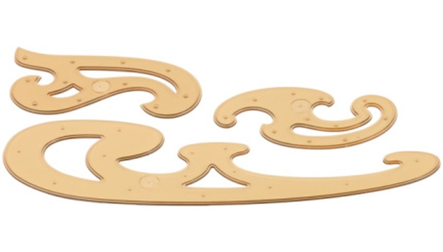
 French Curves
A French curve is a tool composed of different different grades of curves. It allowed designers to make curves when they created compositions using a ruling pen. They were usually made from plastic, metal or wood. Before CAD and graphics software, the french curve was used to create compositions that needed curvature in calligraphy, logos, charts, etc. Honorable mention goes to the t-square, triangle ruler, a drawing angle and protractor. Other industries that once used this tool are architecture, drafting, engineering, fashion and cartography.
Rubylith
Rubylith is a a form of colored masking film (usually orangish red), usually to mask (block out) part of an image. It consist of two films sandwiched together. The bottom film is a clear layer while the top is a very thin colored translucent layer. The top layer can be cut with an x-acto knife and peeled away from the bottom layer. The top layer’s color is light-safe so when photographed, it would block the image beneath and appear black (see example). This allowed for designers and photographers to create photo montages of two different images. Before the development of Adobe Photoshop, graphic software and other digital processes, this was the primary way to do creative photo montages or to mask a portion of the image. Other industries that once used this tool are photography, lithography, electronics and screenprinting.
 Compass
A compass is a technical drawing tool that can be used for drawing circles and curvatures. It consists of two arms connected by a hinge which can be adjusted to allow the radius to change the size of the drawn circle or arc. One arm has a needle point at its end while the other arm is adaptable with a pencil or ruling pen tip. Before CAD and graphics software, the compass was used to create precise circles and arcs needed for logos, etc. Other industries that once used this tool are architecture, drafting, geometry, engineering and cartography.
 Paste Up Process
Paste up is the process of laying out text for a composition to be camera-ready.This included newspapers, books, etc. Once ready, the mechanicals would be photographed with a stat camera to create a negative. This would be used to create the printing plate, a thin metal sheet that the image was transferred to according to the CMYK or Pantone color system. This process came after letterpress printing. The paste up process came with a shorthand language that a designer used to communicate with the paste-up artist. For example, a designer would take the text and circle parts of it labeling it with shorthand printer abbreviations and acronyms.
The paste-up professional had various names: paste-up artist, layout artist, mechanical artist or production artist. Before publication design software, this person would cut the columns of type that was received from photo typesetting into sections and arranged carefully on the board according to the printer acronyms provided by the designer. For example, a 15 inch strip could be cut into 3 5-inch sections. Headlines and other typographic elements were often created and supplied separately by the typesetter, leaving it to the paste up artist to determine their final position on the page. A semi-permanent adhesive was used to allow for the paste-up professional to move the text at will if the layout needed to change. This would be photographed to create the negative that would eventually create the printer plate. This position does not exist anymore because of publication design software.
 Logo
Logo
A logo is a graphic or wordmark used as an identifier for a company/organization. It could be a stylized abstract or representational design and/or could include the name of the company/organization. I won’t get into the history of logos. You can find that on the internet. Important elements in a logo are typography, image, color and shape. A logo’s relationship to the company and consumers has changed over the last 30 years. Today, consumer perception carries more weight than the ‘logo as an identifier’. This is why branding has become more important. Branding is about managing perceptions. With the proliferation of stock logo websites, logo contests, cheap design services (Fiverr) and inexpensive graphics software, anyone and everyone is creating logos today. Because of this oversaturation, the value of a logo is declining.
 Fliers
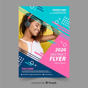
A flier is basically a 8.5 x 11 ad. Fliers can be in color or in black white. Today, fliers are devalued because printing technology has improved and cheapened. Most publication design software have flier templates. This allows the person to simply place their text and image in the necessary areas and print. Also with other graphics software, it is easy to create photo montages with text.
