Do Logos Need to Always Be Deceptively Simple?
Logos are informed by the vision and mission of a brand, company or organization. When done right and executed consistently, it takes on a life of its own. Witness how some companies have extended their logos into other categories such as amazon (Alexa) and Red Bull (Flutag events).
But do all logos need to be super simple…like the Target logo?
The simplistic logo is a byproduct of the Swiss Design style that influenced corporate design in the U.S. This philosophy originated in Switzerland in the 1940s and draws heavily from Gestalt Psychology. This theory posits that the mind effectively simplifies parts by making it into a whole.
The Swiss Style has influenced the development of graphic design in western countries and is recognized by its use of sans-serif typography, grids and asymmetrical layouts. Its primary emphasis is on cleanliness, simplicity and objectivity. In the early days, posters were the most visible ways the style was utilized but it was eventually applied to book covers and logos. Iconic American designer Paul Rand was influenced by it creating well known logos for IBM, Westinghouse and ABC. Before this philosophy, logos were typically crude, illustrative and complex. Check out these original logos below from established American companies:

GE Electric 1890

John Wanamaker Early 1900s

Ford 1903

Shell 1909
Most of my professors at The University of the Arts studied with Armin Hoffman, one of the foremost practitioners of the Swiss style. He taught at the Basel School of Design in Switzerland.
The table below allows you to compare and contrast the Swiss philosophy approach to today’s logo development.
| 1950s Standards | Today’s Standards |
| A logo must embody a singular visual presentation that is consistent across marketing platforms. This was one of the driving forces behind simplicity. | In this era of globalization and digital communications, animation and logo modular systems are becoming popular further eroding a singular visual presentation. |
| Print technology in the 1950s was rudimentary with color printing considered premium. So, a logo needed to maintain its visual integrity when copied in black and white at different sizes. | Print technology is primarily digital now. Although the black and white issue still applies, logos can be printed at smaller sizes in any color with visual integrity intact compared to the past. |
| A logo had to function like a mnemonic device on marketing platforms where one cannot always control how long a viewer will see it. The simpler, the better. | With more marketing platforms, a logo must be able to function at extreme sizes.* For example, how small is a logo when viewed on a smartphone? How large is it on a jumbotron? |
| A logo was meant to serve its audience, not the designer. | There is an ongoing argument about whether a logo can reflect a personal aesthetic. |
*In the past, graphic designers often visually modified a logo so well to function at small sizes that the average consumer did not notice it. This approach seems to have waned over the years.
Here are a two examples that push the boundaries of cleanliness, simplicity and objectivity:

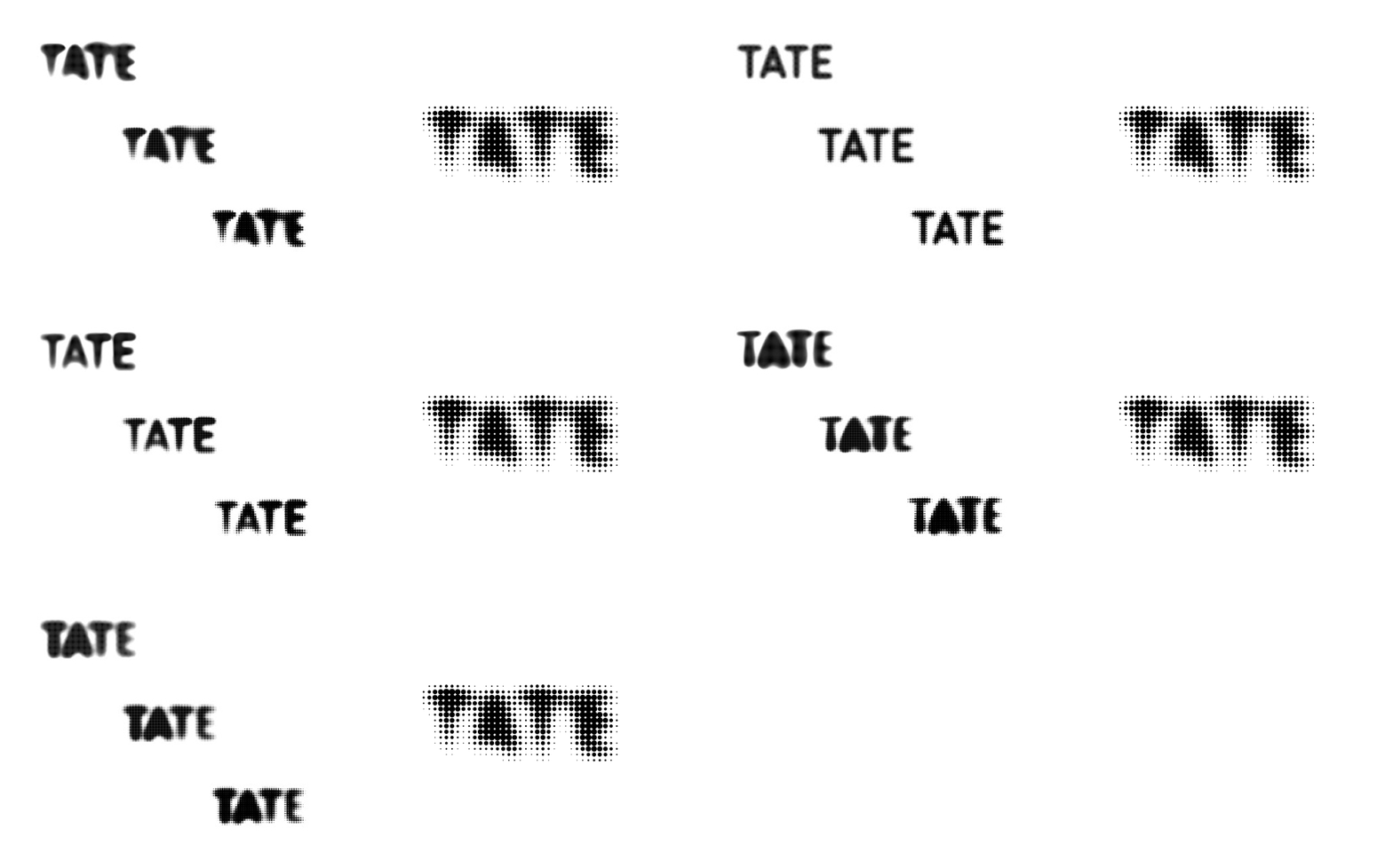
The Tate Museum is a family of four art galleries in the UK. This logo was designed by Maria Willer of Wolff Olins (now with Pentagram). Note: This logo was redesigned and changed slightly.

Fugue, Inc. is a software company that automates the creation, operations, and regeneration of cloud infrastructure. Sagmeister and Walsh designed this logo in 2015. Interestingly, this logo is not on the company’s website. (Buyer’s regret, maybe? I dunno.) Neither the Tate Museum’s logo or the Fugue, Inc. logo would be considered simplistic. Or, are they a different kind of simplicity?
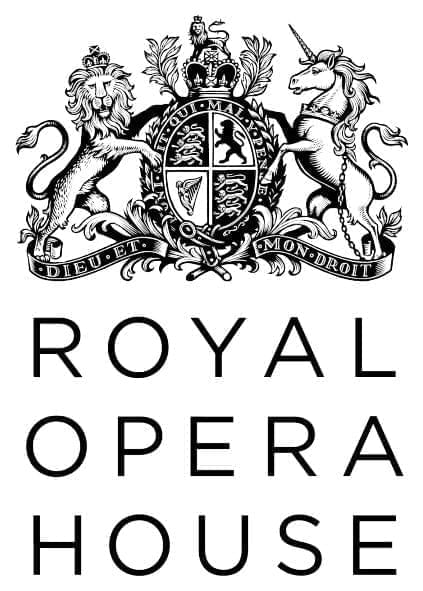
Large global brands tend to have some of the most simply designed logos. But there are industries where simplicity either means something entirely different or isn’t a highly valued trait for a logo. For example, the logos below are reminiscent of heraldry where a coat of arms was used to represent achievement and status by a family, town or business. Typically, they are ornamental with illustrative detail. These logos break some of the rules in Swiss Design philosophy.


So, does a logo need to be simplistic like Apple?
I believe simplicity is the ideal but I strive for context and clarity. In other words, simplicity is a given. But I also pay attention to the audience (context) and the harmony with the components in the logo (clarity) that may make me question whether simplicity is the highest goal. I especially like projects that have a niche audience. IMHO, the smaller the audience, the more graphically complex the logo can be.
There is also this mistaken notion that an audience should be able to look at a logo and know intuitively what it represents. If this were true, no one would develop abstract logos for companies like Chase Manhattan, Minolta, Mitsubishi and many others. Logo design legend Tom Geismar said that a logo is simply an empty vessel that meaning is poured into. The audience will trust what the logo represents IF they trust the company’s vision and mission. This is why some of the most deceptively simple logos (Apple, Target, McDonald’s, etc) in the world aren’t always visually unique or clever. They are simply branded well which has given them tremendous brand equity over time. International design juggernaut Pentagram knows this too well: They create very simplistic logos that are designed to function inside of dynamic brand identity systems. But then again, they are designing for global brands, not the small nonprofit down the street. Doesn’t that make a difference?
You can decide for yourself if all logos need to be deceptively simple. I think it depends. BTW, the logo at the top was Apple’s first logo designed in 1976. In 1977, they switched to the multi-colored apple fruit logo.
What do you think?
