Case Study: Multipurpose Retail & Community Space
Case Study: Multipurpose Retail & Community Space
Strategy: Brand a multipurpose retail & community space for the most diverse neighborhood in Philadelphia.
Primary logotype
Secondary logotype
Signage Logotype
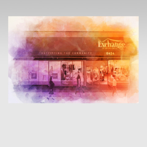
Storefront: Artist rendering
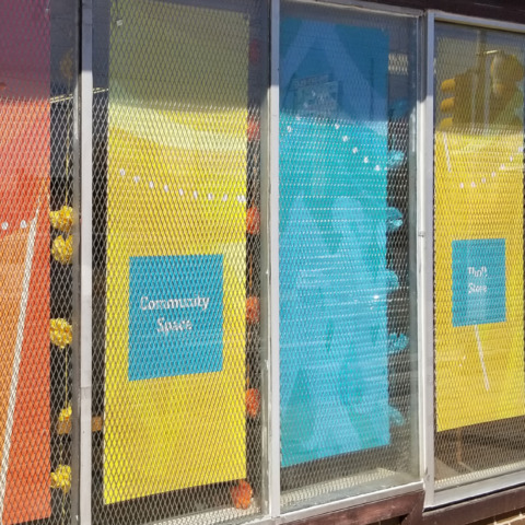
Window Graphic

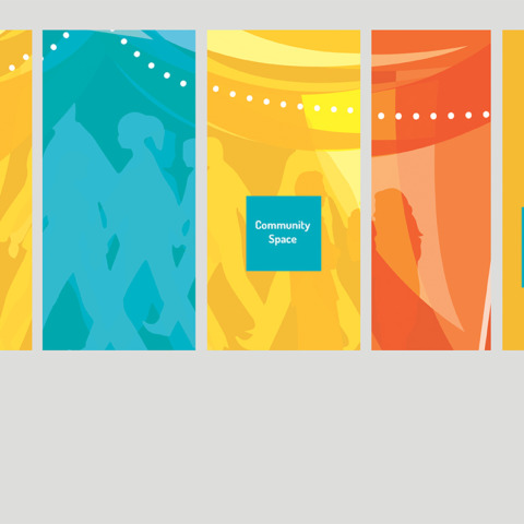
Digital Graphics

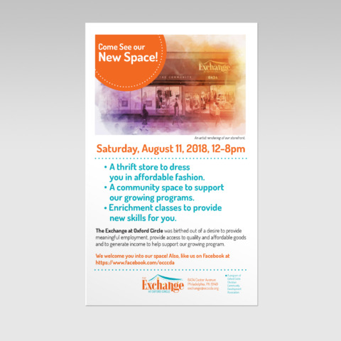
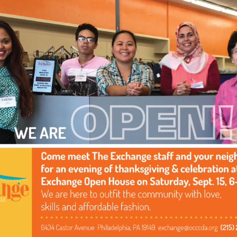
Flier
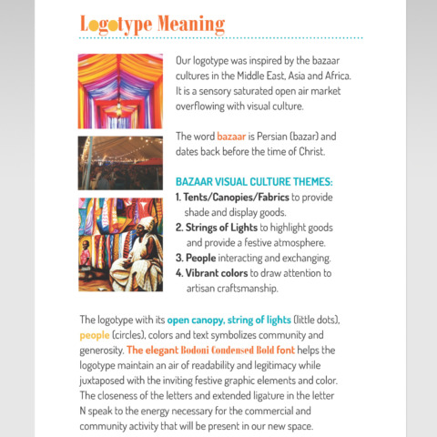
Logotype Meaning
postcard1a_Page_1
front posters
TE1
TE2
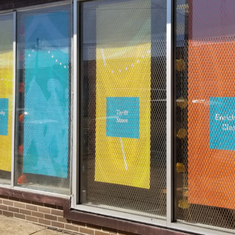
TE3
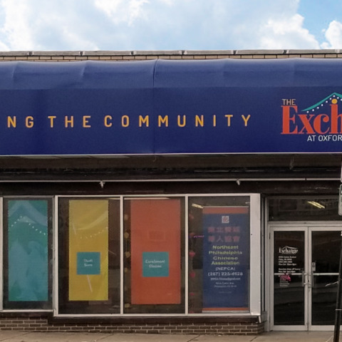
TE8
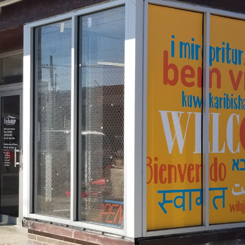
TE5
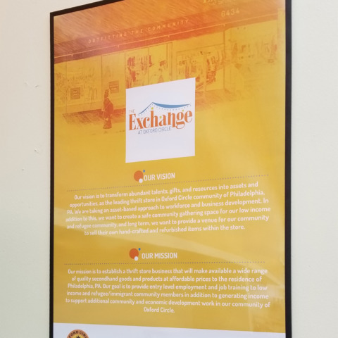
TE4
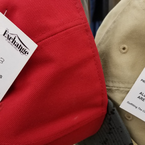
back posters
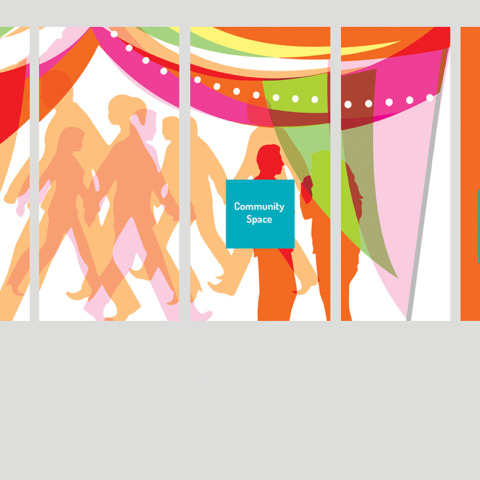
TE12
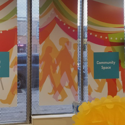
TE9
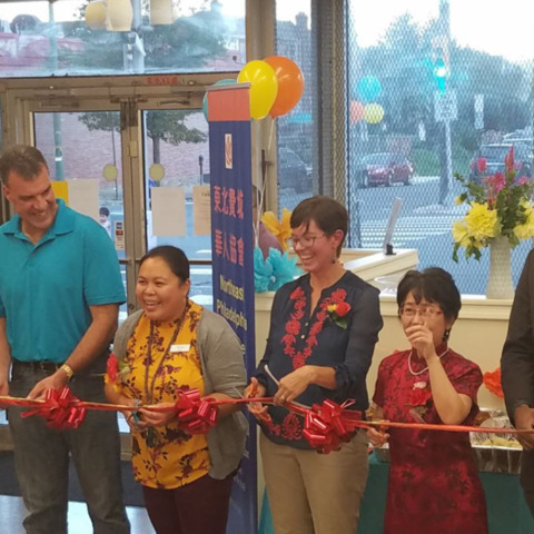
TE10
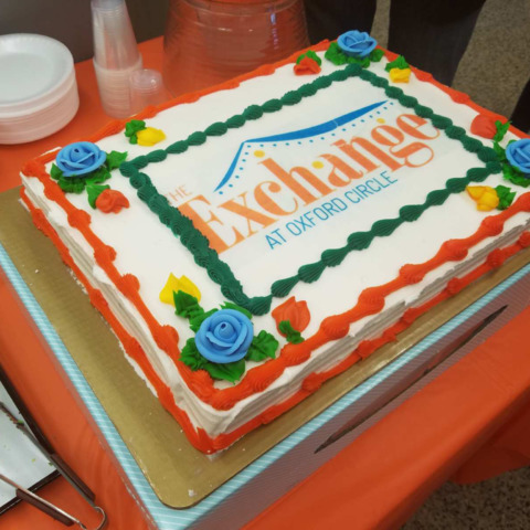
The Exchange is an initiative of the Oxford Circle Christian Community Development Association (OCCCDA). They focus on the Oxford Circle neighborhood which is the most diverse in Philadelphia. OCCCDA develops programs that revolve around family, community and economic development. This space will engage in retailing used merchandise that are donated by the community for the purpose of employing local residents and raising money for their economic development programs.
Audience: Working class people, immigrants and local businesses.
The multipurpose space includes:
- Thrift Store
- Community space
- Enrichment classes
There was a recognition of the need for branding because of the diversity of the area. OCCCDA wanted a consistent visual look that would appeal to a diverse audience and sense of community. Research on the neighborhood and thrift store names was initiated to develop their present name and look.
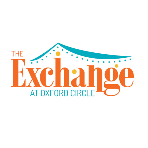
The logotype was inspired by the bazaar cultures in the Middle East, Asia and Africa. It is a sensory saturated open air market overflowing with visual culture.
Bazaar visual culture themes:
1. Tents/Canopies/Fabrics to provide shade and display goods.
2. Strings of Lights to highlight goods and provide a festive atmosphere.
3. People interacting and exchanging.
4. Vibrant colors to draw attention to artisan craftsmanship.
The logotype with its open canopy, string of lights (little dots), people (circles), colors and text symbolizes community and generosity. The elegant Bodoni Condensed Bold font helps the logotype maintain an air of readability and legitimacy while juxtaposed with the inviting festive graphic elements and color. The closeness of the letters and extended ligature in the letter N speak to the the commercial and community activity that will be present in this new space.
Update: This initiative opened in 2015. Unfortunately because of the pandemic, it had to close in 2021. Thank you to OCCCDA and The Exchange for allowing me to be part of your vision.
Deliverables
Nomenclature
Logo Research
Logo Design
Stationery
Digital Graphics
Branding Guidelines
Marketing & Donor Materials
Interior/Exterior Signage
Window Graphics
Holiday Marketing Plan
