Case Study: Pregnancy Center Rebranding Project
Case Study: Pregnancy Center Rebranding Project
Strategy: Rebrand to improve image and reposition to reach new and existing audiences.
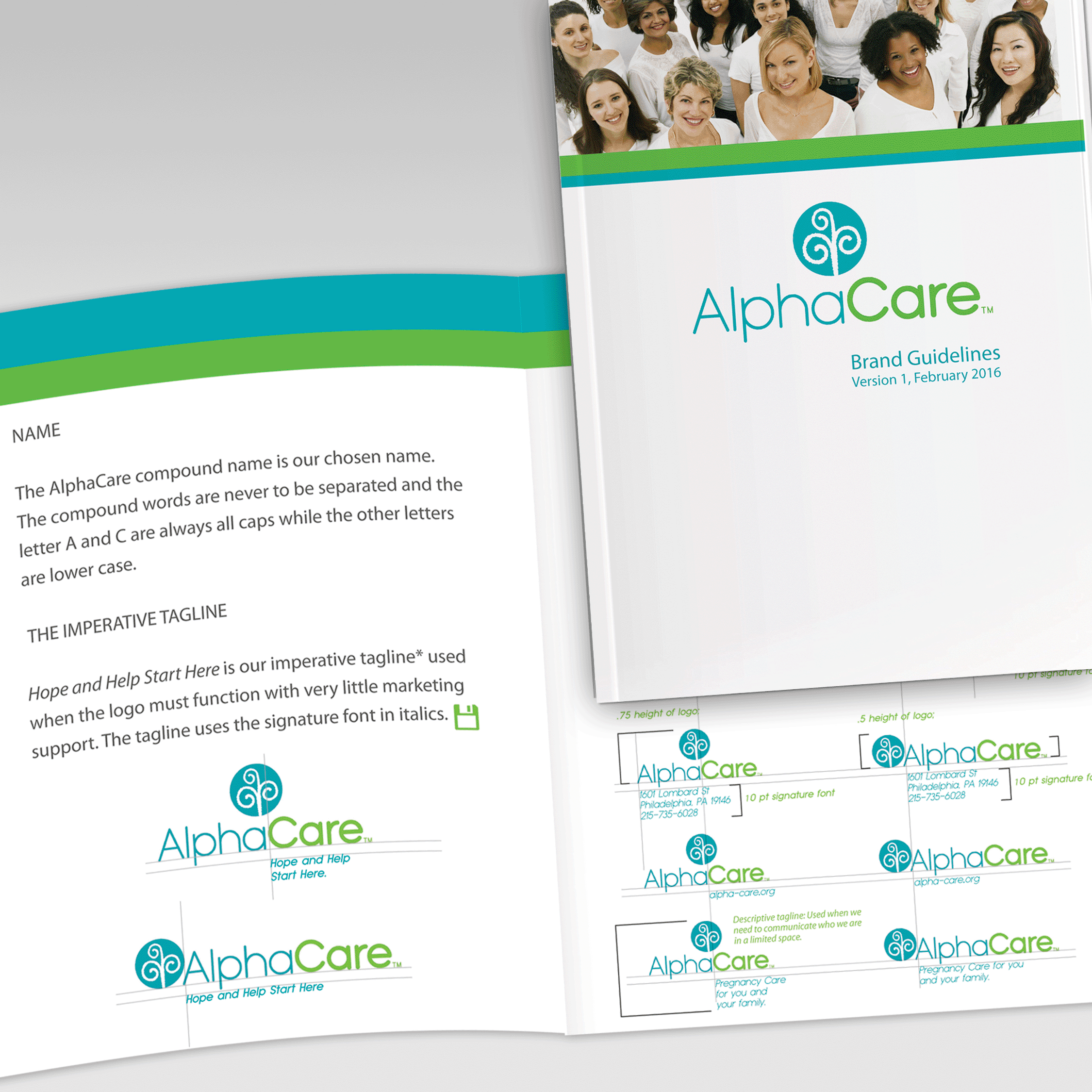
AlphaCare Logo Guidelines
AlphaCare Postcard

AlphaCare Storkbus Brochure
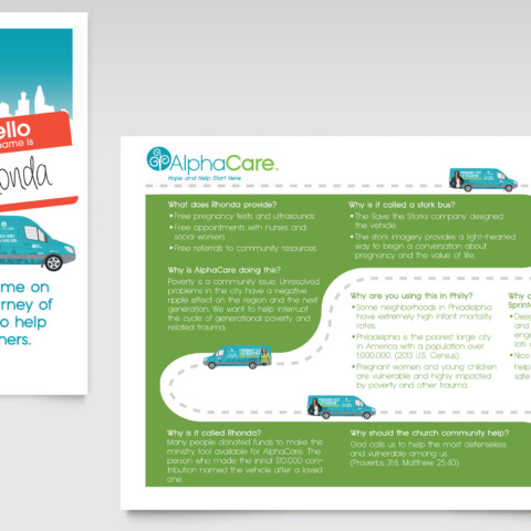
AlphaCare Materials
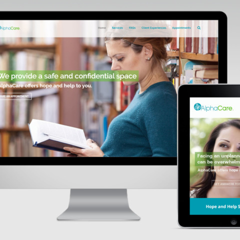
AlphaCare interactive
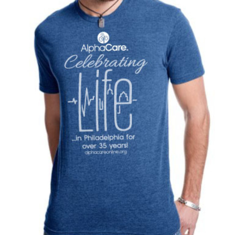
AlphaCare Tee
AlphaCare Tote Bag
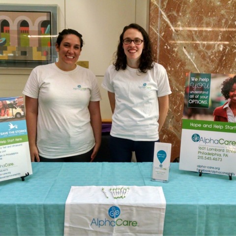
AlphaCare Sign

AlphaCare Stork Bus

AlphaCare Stork Bus

AlphaCare offers a holistic approach, an affirming embrace and a network of resources to pregnant women in Philadelphia. They practice compassionate care through listening, educating and walking with women who experience an unplanned pregnancy.
They came to us seeking to change their name and market repositioning since their services had broadened over the past 30 years. They wanted a new name and look that reflected this growth.
Audience: Working class women, ages 18-34 and donors
First, we conducted internal and external research and submitted a Creative Brief that detailed how they should reposition themselves with their two key demographics. Once this was completed, we conducted a Naming workshop that helped narrow the name concepts. Once a few names were selected, basic trademark research was done to determine availability. Although the search revealed that AlphaCare was a common nonprofit name used across the U.S., the nonprofit still wanted to use the name. In addition, their lawyers did an exhaustive trademark search and determined that other nonprofits with the same name were either not in the Greater Philadelphia area and/or were in another service industry. Once the name was trademarked and settled, the logo process began.
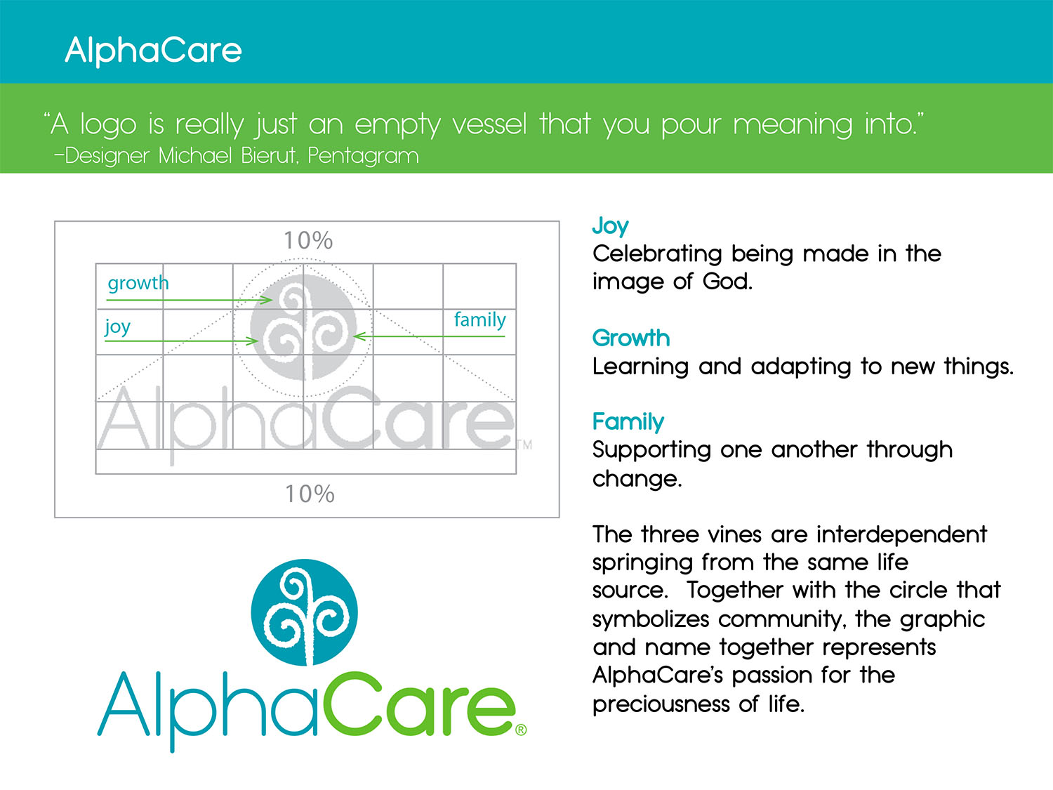
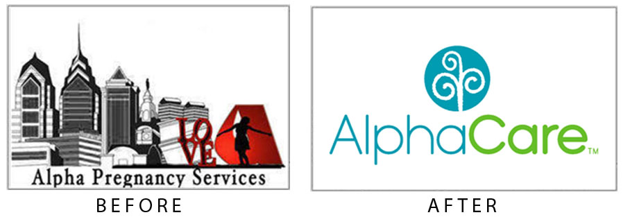
 Their former logo (above left) was a complex illustration that did not adapt well at small sizes in different mediums. While doing logo research, I was inspired by observing the free spirited nature of vines at the Phipps Conservatory and Botanical Garden in Pittsburgh, PA. As they grow, vines reach up and across connecting to anything that will support its movement in an elegant fashion. Although viewed as aggressive, you cannot deny that they are full of life.
Each component below represents one of the three curly vines in the graphic part of the logo:
-
-
- Joy: Celebrate being made in the image of God.
- Growth: Learning and adapting to new things.
- Family: Supporting one another through change.
-
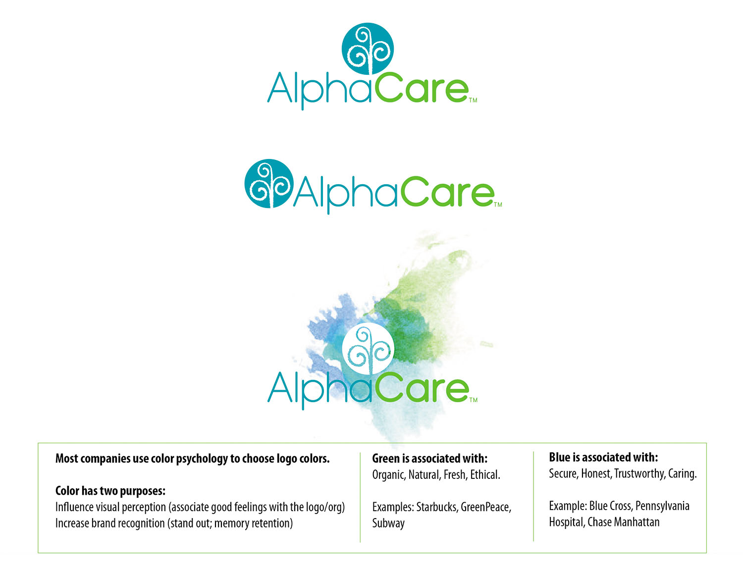
The three vines are interdependent springing from the same life source. Also, the three vines represent an abstract female figure. Together with the circle that symbolizes community, the new logo represents AlphaCare’s passion for women and the preciousness of life.
Deliverables
Nomenclature
Market/Audience/Design Research
Ceative Brief
Logo Design
Basic Trademark Search
Stationery
Website
Branding Guidelines
E-newsletter Template
Newsletter Template
Social Media Management
3-month marketing schedule
Marketing Materials
Signage
“Ron led our organization through a comprehensive process that resulted in much more than a new logo and style sheet. We have a new appreciation for who we are (and who we are not). Ron was careful, deliberate and professional. I am especially grateful for how Ron included the members of our board and staff in the process. Rebranding helped launch AlphaCare into a new era of growth.”
–Karen Hess, Executive Director, AlphaCare
